How Has the Pandemic
Shifted Color Trends for 2022?
How Has the Pandemic Shifted Color Trends for 2022?
Credit/Creatas Video+ / Getty Images Plus, via Getty Images.
By Kristin Johansson, Editor-in-Chief, Paint & Coatings Industry Magazine, Troy, MI
Video: Creatas Video+ / Getty Images Plus, via Getty Images
The coronavirus pandemic has altered all aspects of business and personal life. In late November 2020, when the Color Marketing Group® (CMG) released its Key Colors for various regions of the world, I was curious to learn how the color forecasting process was affected, both in choice of colors and in the research process. I reached out to Montaha Hidefi, Vice President Color Forecasting, Color Marketing Group, Color Landing Studio, in Ontario, Canada, to find answers to my questions.
PCI: How has the pandemic shifted color trends for 2022?
Hidefi: As it is well known to color forecasters, a globally experienced event such as the pandemic has an enormous impact on the color landscape and the direction that color follows. Last year, when we started the virtual forecasting process at the Color Marketing Group (CMG), it was somehow alarming, because while we were forecasting for 2022, most participants were submerged in the “here and now”. As if time would stand still for the following two years and we would be in the same situation down the road.
It was extremely difficult for everyone to disconnect from the present. When we examined the over 1,000 colors submitted by participants globally, more than one third of them were practically achromatic and nearly toneless. But at the same time, we also noticed many chromatic, some muffled and some vibrant, blue, green and yellow colors that balanced the sombre ones.
After the virtual steering process, in which the regional forecasting committees curated the submitted colors to obtain the regional forecasts comprised of 64 colors, it was evident that the forecast was dominated by neutral shades and moods. Nonetheless, the direction telegraphed soft hues, medium chromas and pure, vivid colors, depending on the region.
In addition, for 2022 the prediction is that blue will continue in a broader range, and green will become more apparent. The yellow family will extend, however, with a swing in the direction of orange. Purple will rise in importance as well.
This color direction relates largely to the color stories that described the rational behind the color forecast. They reflected societal, economic and technological trends, such as the duality of our digital and real worlds, change and transformation, truth and science, personal growth, and resilience. The environment, climate change and finding our voices also surfaced as important drivers in the forecast. The Key Color determined by each region reflected this direction.
PCI: Can you describe the Key Colors?
Hidefi: The Key Colors for 2022 deliver a message of hope and renewal. This is the first time that two CMG regions forecast a color from the yellow family as their Key Color. Although different in chromaticness, they are both red-influenced and share the same level of brightness.

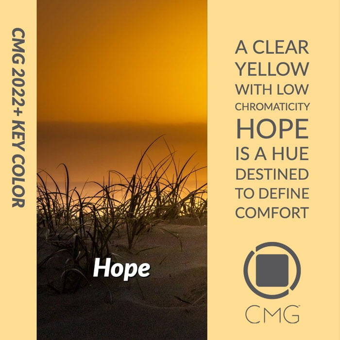
The Asia Pacific region forecasted Hope. A low-chroma, clear yellow, Hope exudes optimism and restoration as the region, with the world, continues to emerge from the pandemic.
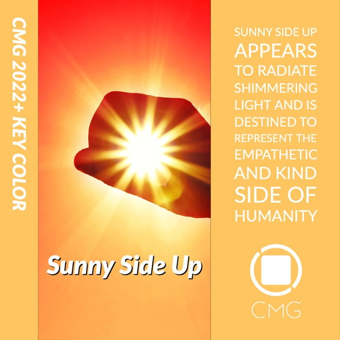
The European region forecasted Sunny Side Up. A soft, medium-chroma yellow, Sunny Side Up shimmers with light. It is intended to characterize the empathetic and kind sides of humanity.
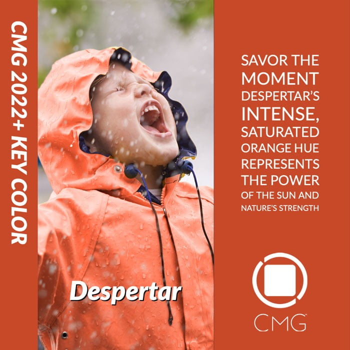
The Latin America region forecasted Despertar, Spanish and Portuguese for “Awakening”. An intense, high-chroma orange, Despertar is representative of the power of the sun and nature’s strength. It symbolizes the emergent spirit of change and growth for the region.
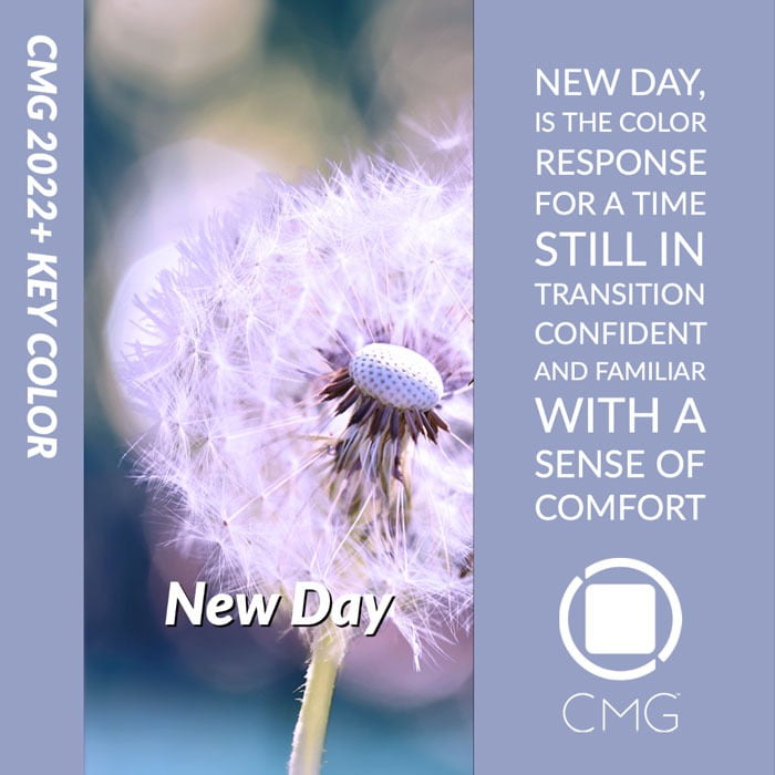
Lastly, the North American region forecasted New Day. A light, low-chroma, fresh blue with red influences, New Day conveys a classic connotation of hope and new beginnings. It suggests confidence and familiarity to greet 2022 with a sense of comfort.
PCI: Has the pandemic increased the importance of color in different markets?
Hidefi: As the definition of a future normal is still under development, 2020, as well as this interim year leading to 2022, have changed business models as we all know it. Whether at home, in commercial or institutional spaces, the implication of eco-living becomes essential for interior settings. Creating welcoming and energized interiors, as well as designing with nature-inspired colors will convert our spaces into safe and warm harbors.
Room-scapes will be designed to enhance well being and boost open communication while serving as a respite from difficult times. Beyond individual items, such as furniture and accessories, and past the walls, ceilings and floorings that provide a frame to our daily lives, the kitchen has become an integral part of home life, serving as a multi-purpose area for food, work and home schooling. Tabletop products ranging from appliances to tableware, textiles to case goods will demand a warm and soothing definition of color to create a continuous flow of energy.
With the prolonged wearing of a face covering, and the exponential growth in online interactions, cosmetics, fashion, graphic design, cinematography settings and all types of visual communications will be more expressive by 2022. On-screen or in the street, colors will be required to make a bold statement.
Fashion accessories and personal items are set to embrace even more color with various sheen levels or special effects that suggest familiarity, genderless and ageless, all the while creating new aesthetics.
PCI: How was color forecasting in 2020 different to previous years due to COVID-19?
Hidefi: It is important to highlight that when we deal with color in a concrete way, our perception of color is influenced by a variety of factors, including natural or artificial light, neighboring colors, angle of view and the sight fitness of the observer. Due to these considerations, the convention is that color forecasting is done in settings where forecasters can visually examine the color and its nuances. Pre COVID-19, Color Marketing Group hosted various ChromaZone® forecasting events around the world, the result of which are distilled into four regional color forecasts.
By March 2020, as the pandemic started expanding across the globe, out of 14 scheduled ChromaZone events, we had hosted only two. The safety of CMG members and participants to any in-person event topped our concerns to fulfill the events planner. The tension at the Executive Committee level was naturally high as the future of color forecasting was at stake. We all agreed to save the moment and explore virtual forecasting, which, as far as we knew then, had not been done by any color organization.
We recognized the challenges digital color communication represented, because the accuracy of evaluating color digitally is even more complex than in-person, as it is affected not only by human factors, but largely by hardware and software parameters, such as individual screen calibration, screen aging, in-room illuminants and so on. The biggest issue to overcome was the absence of a tool that would communicate color digitally in a consistent and reliable way.
PCI: Were you able to find such a tool?
Hidefi: Traditionally, to meet the needs of various industries, CMG communicates color through various color systems, including NCS, RAL, Pantone and Munsell. After careful consideration, we came to an agreement that NCS Colour System would be the most suitable for participants to interpret their color choices on screen.
This, we believed, would allow us not only to use a universal color language across various geographical areas, but also to validate the digital color values against NCS physical swatches to maintain the integrity of the color. But that was another dilemma, because not all participants had access to NCS physical tools.
PCI: How did you solve this problem?
Hidefi: With the support of CMG Color Forecasting Committee, we created guidelines and videos for color conversion to NCS. After participants submitted their color forecasts, we numerically and visually authenticated the accuracy of each digital color value against the NCS tangible swatch to ensure the on-screen color matched the actual swatch.
Truth be told, the process wasn’t flawless at the initial stages, but we polished it as we went through the ChromaZone events. We were determined to beat the lockdown restrictions and ended up hosting 14 virtual forecasting events. They were well attended and attracted numerous color professionals that otherwise wouldn’t have had an opportunity to participate in an in-person setting.
There had never been a better time than during the COVID-19 lockdown to test our resilience as an organization and explore a distinct method to forecast color. We adapted to the new normality. We rounded off the process with the reveal of CMG 2022+ World Color Forecast™ at our maiden Virtual Summit last November, which attracted over 200 color professionals and enthusiasts from as far as Australia and the Middle East.
This year, due to their popularity and the constant restrictions to host in-person gatherings around the world, we continue to host virtual ChromaZone forecasting events in various time zones and languages other then English, including Spanish and French.
For the future, it is our hope that technology advancements will deliver better solutions to communicate and visualize colors on-screen in a universally recognized, simple and impartial method. Such tools are not limited to color forecasting, but they are important for any digital color communication purpose.